Department of Education Redesign
Redesigning naviagtion through information architecture

PROBLEM
The current U.S Department of Education’s website lacks a modern user interface and structured information architecture.
This makes it difficult for users to navigate through the site.
SOLUTION

IDENTIFYING THE PROBLEM
Users feel unsure about the organization of the site, leading them to question where they should look for information.
Upon initial analysis of the current website, the lack of clear information architecture is obvious. It is not clear where the information the user is looking lies within the website, and without any kind of secondary navigation menu, the user is forced to keep going from page to page until they find it. I conducted usability tests with 5 participants to further understand the site’s navigation. I gave them all the task on locating grant eligibility on the Department of Education’s website.
USER RESEARCH QUESTIONS
What prompted you to make clicks where you did?
What made you believe it would lead you to your goal?
What do you feel could have made the process easier?
At what points did you hesitate?
Why do you think you hesitated where you did?
IDEAS+SOLUTIONS

USER PERSONA
Understanding the User
With insights from the user interviews in mind, I created a user persona to help me better understand the user’s motivations, goals and frustrations.

CARD SORTING
Card sorting is a helpful way to organize information on a site in a way that guides the user through a thoughtful navigation system. Card sorting helps to create a set of expectations for the user throughout the site.
Card sorting for effective navigation.
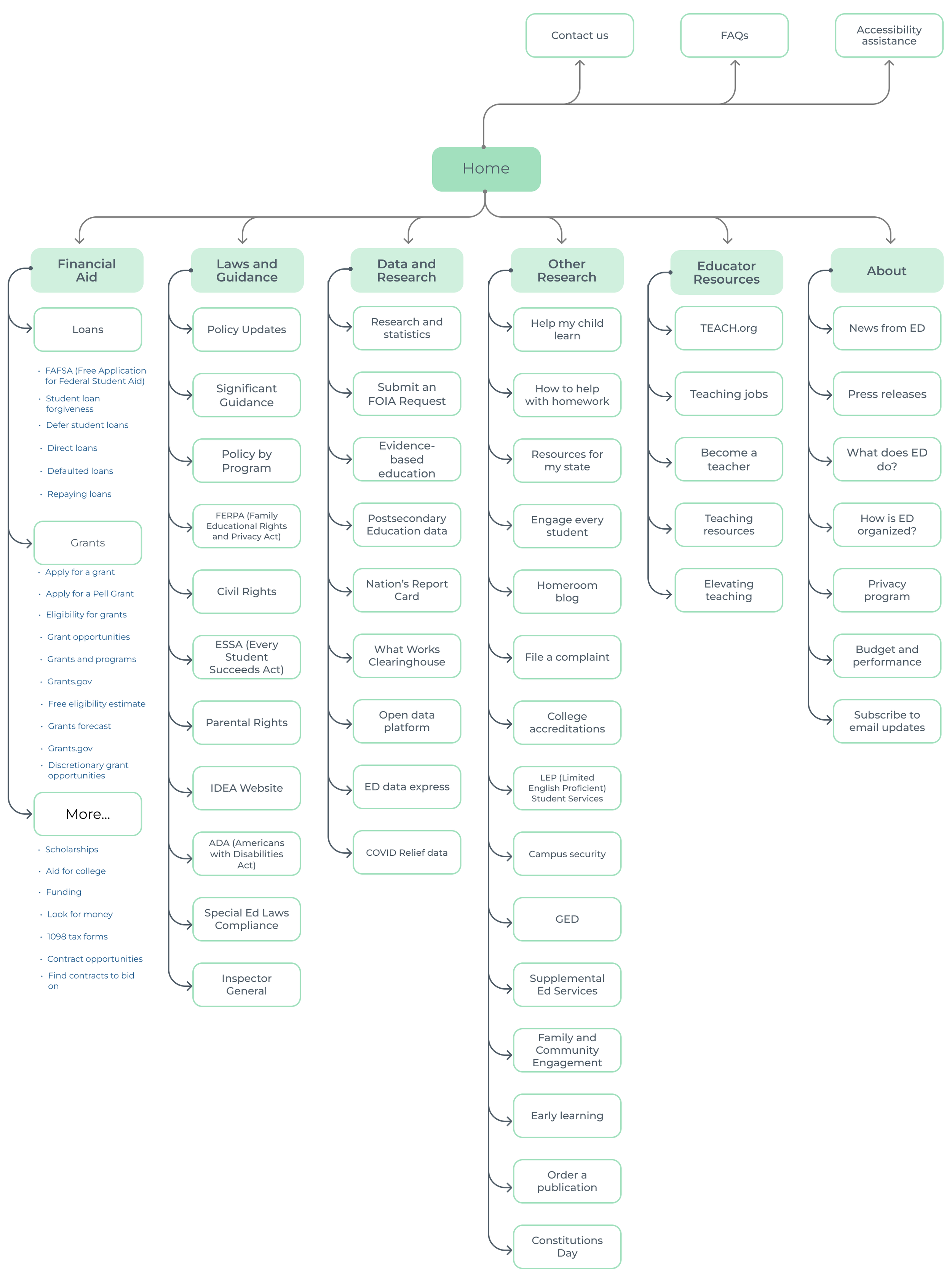
SITEMAP
Refining the navigation
IMPROVEMENTS+TESTING
Fewer clicks, quicker results
I conducted usability tests with my clickable prototype with 4 participants to determine opportunities for improvement within my design. From the usability testing, participants were able to give me feedback, which I can then use in future iterations.
THE FINAL DESIGN
Final design
OTHER CONSIDERATIONS
Reflections+what I’d do differently next time
This case study serves as a starting point for a site-wide redesign of the Department of Education’s website. The next steps I would take would be to continue to conduct usability testing and reiterate my designs to better accommodate users’ needs and wants. The ultimate goal of this project would be to substantially improve the usability and experience of the entire site.